How to Choose the Right Colour for Your Kitchen Respray in Surrey
One of the first questions homeowners ask when they contact us about a kitchen respray is: “How do I choose colour for a kitchen respray in Surrey?” It sounds simple. In practice, it’s the decision that keeps people up at night. Get it right and your kitchen looks exactly as you imagined. Get it wrong and you’re living with it for years. This guide walks you through how to approach it properly — the same process we use with clients every day.
Why Colour Choice Matters More in Spraying Than in Painting
When you respray kitchen cabinets, you’re committing to a factory-quality finish. No brush marks. No roller texture. Just a smooth, hard-wearing surface that looks like it came straight from a manufacturer. That level of finish brings out colour in a way that a painted surface simply doesn’t.
A colour that looks soft and muted on a sample card can read very differently across an entire bank of cabinets. A deep navy that works beautifully on a single island can feel oppressive across a full run of units in a smaller room. Understanding how colour behaves at scale is the first thing to get your head around.
Start With Your Fixed Elements
Your kitchen has things that aren’t changing — the worktops, the floor, the tiles, the appliances. These are your fixed points. Every colour decision should work with them, not against them.
I always tell clients to look at the undertones in their worktop first. Most stone and composite surfaces have a warm or cool bias that isn’t obvious at first glance. A grey worktop with warm beige undertones will fight against a cool blue-grey cabinet colour. A white marble with cool blue veining will sit awkwardly next to warm cream units.
Take physical samples into your kitchen. Hold them against the worktop in natural light. Look at them morning and evening. Artificial light shifts colour dramatically, and kitchens get used at all hours.
Understanding Light in Your Kitchen
North-facing kitchens get cool, flat light all day. Colours with grey or blue undertones can look dull and heavy. Warmer tones — soft whites, muted greens, earthy taupes — tend to perform better in these spaces.
South-facing kitchens have strong, warm light for most of the day. They can handle cooler colours well. A soft slate blue or sage green that might look washed out elsewhere reads beautifully in a bright, sun-filled room.
The size of your kitchen matters too. Lighter colours open up smaller spaces. Darker colours add depth and drama but work best where there’s enough natural light to stop them feeling closed in.
The Most Popular Colour Choices We See in Surrey Kitchens Right Now
Trends shift, but some choices have staying power. These are the colours we’re spraying most frequently right now across Surrey and South London:
- Shaker white and off-white: Timeless. Works with almost anything. Farrow & Ball’s Strong White and Wimborne White are perennial favourites — both warmer than a pure brilliant white and far more forgiving in different lights.
- Sage and muted greens: Still going strong. Mizzle, Mould, Saxon Green — all popular. They bring warmth without being yellow and a natural quality without being loud.
- Navy and dark blues: Particularly on islands or lower cabinets in a two-tone scheme. Deep, confident colours that age well.
- Warm greys and greiges: A step away from the cooler greys that dominated the last decade. More forgiving, warmer, easier to live with long-term.
- Charcoal and near-black: A bold move that pays off in the right kitchen. Works exceptionally well with brass or copper hardware.
Two-Tone Kitchens: Getting the Balance Right
Two-tone kitchens — different colours on upper and lower cabinets — are genuinely popular, and we spray a lot of them. Done well, they add depth and interest. Done badly, they’re a visual mess.
The rule I work to: keep contrast intentional. A very light upper and a deep lower works because the contrast is deliberate. Two mid-tones that are slightly different from each other tends to look like an accident.
The most reliable approach is to choose your hero colour for the lowers (or the island) and pair it with a neutral — usually a white or off-white — on the uppers. It gives you the drama without overwhelming the space.
We Can Match Any Colour — Including Farrow & Ball
We colour-match to any specification. If you’ve got a Farrow & Ball colour you love, we can match it exactly in the Tikkurila water-based system we use — which gives a harder, more durable finish than Farrow & Ball’s own product, with lower VOC emissions to boot.
Bring us a colour code, a paint card, even a fabric swatch. If you can describe it, we can match it.
Practical Things to Do Before You Decide
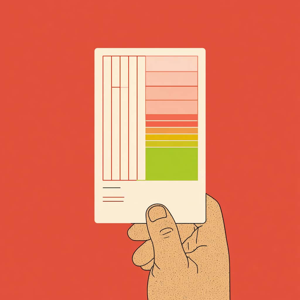
- Order large sample cards — A4 or bigger — not the small chips. Colour reads completely differently at scale.
- Look at the samples in your actual kitchen, at different times of day.
- Live with your shortlist for at least a week before committing.
- Consider what you’ll change along with the cabinets — new handles, new worktop. Factor those into the decision now.
- Think about resale. Deep or unusual colours can divide buyers. If you’re selling in the next two to three years, a more neutral palette is a safer investment.
We’ll Help You Work It Out
Choosing the right colour is part of what we do. It’s not just about spray application — it’s about the whole result. We talk clients through this process on every job. By the time we start work, there are no doubts.
We’ve been doing this since 2004, and our kitchen respray service covers the full process from initial consultation through to a 10-year guaranteed finish. Our work is City & Guilds qualified and we use professional-grade materials throughout. If you’re looking for specialist spray painting services across Surrey and South London, we’d welcome a conversation. Call us on 0203 355 1495 or get in touch online to talk through your project.
Frequently Asked Questions
FAQ
Q: How do I know if a colour will look right once my kitchen cabinets have been resprayed?
The best approach is to test large samples — A4 size at minimum — in your actual kitchen space, at different times of day and under both natural and artificial light. Small colour chips are notoriously unreliable because colour reads very differently at scale. We always encourage clients to take time over this decision before we begin. A colour that looks right on a chip may need adjusting once you see it across a full run of cabinets, which is why we discuss your fixed elements — worktops, flooring, tiles — as part of the colour consultation process.
FAQ
Q: Can you match Farrow & Ball colours exactly for a kitchen respray in Surrey?
Yes. We colour-match to any