Farrow & Ball Kitchen Colours: Which Work Best for a Respray?
One of the most common questions I get from homeowners is whether we can match Farrow & Ball kitchen colours for a respray. The short answer is yes — and it’s one of the things that makes a professional kitchen respray genuinely transformative. Getting the Farrow & Ball kitchen colours respray right, though, isn’t just about picking a shade from the card. It’s about understanding how those colours behave on cabinetry, under kitchen lighting, and through a spray finishing process. Let me walk you through what we’ve learned over 20 years of doing this.
Why Farrow & Ball Colours Are So Popular for Kitchen Resprays
Farrow & Ball have built a strong following for good reason. Their colours have a depth and complexity that standard paint ranges struggle to match. The pigment combinations produce shades that shift depending on the light — warmer in the evening, cooler in daylight. On kitchen cabinets, that quality reads beautifully.
But there’s a catch. Farrow & Ball’s own wall paints aren’t suitable for spraying onto cabinetry. They’re not formulated for hard surfaces that take daily wear. What we do instead is colour-match their shades precisely, then spray using a professional-grade water-based lacquer — typically from Tikkurila — that’s specifically engineered for furniture and cabinetry. You get the Farrow & Ball colour you want, with a finish that will actually last. That’s the combination that works.
The Colours That Perform Best on Kitchen Cabinets
Not every Farrow & Ball shade translates equally well to cabinet spraying. Here’s my honest take on the ones we see chosen most often — and why some work better than others.
Shaded White (No. 17)
Still one of our most requested shades. It reads as white without being cold or clinical. Works in almost any kitchen, any aspect. If you’re unsure about going bold, this is a reliable starting point. Hides nothing in terms of prep quality — which is fine, because our preparation is thorough.
Elephant’s Breath (No. 229)
A greyed-out mauve that changes dramatically between daylight and artificial light. In south-facing kitchens it can look almost pink in the afternoon. Worth getting a large sample on the actual door before committing. We can do that for you before we start.
Mole’s Breath (No. 276)
A darker, more serious grey. Sits well with brass or brushed gold hardware. Strong enough to anchor a kitchen without feeling oppressive. Very popular in Surrey homes with traditional cabinetry profiles.
Hague Blue (No. 30)
This one always gets a strong reaction — usually positive. A deep blue-green that photographs exceptionally well and looks even better in person. Works best in larger kitchens or where the uppers are a lighter contrasting colour. We’ve done a lot of two-tone Hague Blue and Wimborne White combinations over the last few years.
Railings (No. 31)
Almost black, but not quite. It has warmth that true black lacks. On slab doors it can look very contemporary. On shaker profiles it reads more traditional. Incredibly versatile. One of my personal favourites.
Cromarty (No. 285)
A soft mid-grey with blue undertones. The safe middle ground between a statement shade and plain white. Works in north-facing kitchens where cooler light is a consideration.
Two-Tone Kitchens: The Combinations That Work
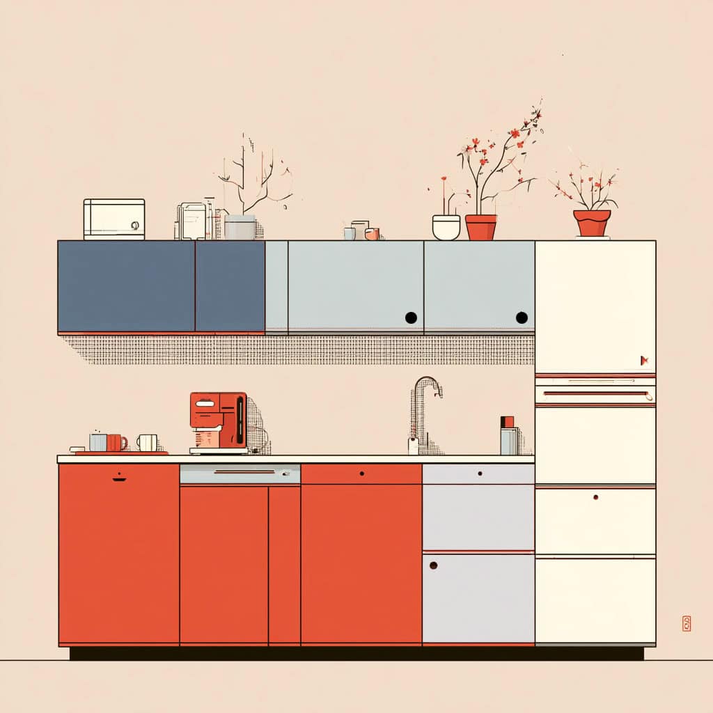
Two-tone kitchens — darker lowers, lighter uppers — have been popular for several years and show no sign of going away. Done well, they add depth and visual interest. Done badly, they look confused.
The combinations we see working consistently:
- Hague Blue (lowers) / Wimborne White (uppers) — classic contrast, always looks deliberate
- Railings (lowers) / Cornforth White (uppers) — sophisticated, works well with marble worktops
- Mole’s Breath (lowers) / Dimity (uppers) — softer contrast, suits country-style kitchens
- Inchyra Blue (lowers) / Strong White (uppers) — one of the more interesting combinations, especially in older properties
The key principle: keep at least three to four steps of tonal difference between the two. Too close in tone and it just looks like an accidental mismatch.
How We Match and Apply Farrow & Ball Colours
We use professional colour-matching equipment to replicate Farrow & Ball shades in a suitable cabinetry lacquer. The match is very close — in most cases, indistinguishable to the eye under normal conditions.
The application process matters as much as the colour. We remove all doors and drawer fronts and take them to our workshop. Cabinet boxes are sprayed in situ. Everything is cleaned, degreased, lightly abraded, and primed before a single coat of colour goes on. The result is a factory-quality finish — no brush marks, no roller texture, no sags.
We use low-VOC water-based paints throughout, which matters if you’re living in the house while we work. Odour dissipates quickly. Most jobs are complete in around five days.
One Thing Worth Knowing Before You Choose
Farrow & Ball produce physical colour cards, but they’re small. A shade that looks perfect on a 5cm square can feel very different across an entire kitchen. Before you commit, ask us about testing the colour on a couple of actual doors first. It takes a small amount of time and it saves regret. We’d rather you were certain.
If you’re also considering updating your windows or external doors at the same time, our UPVC spray painting service can colour-match to the same shade — so everything reads as a considered whole rather than a series of separate decisions.
Ready to Choose Your Colour?
We’ve been spraying kitchens across Surrey and South London since 2004. If you’re considering a kitchen respray and want to talk through which Farrow & Ball shades will work for your space, I’m happy to have that conversation. Visit our kitchen respray service page to see examples of our work, or take a look at our full range of spray painting services. You can also call us directly on 0203 355 1495. No obligation, no pressure — just straightforward advice.
FAQ
Q: Can you exactly match any Farrow & Ball colour for a kitchen cabinet respray?
We can get extremely close to any Farrow & Ball shade using professional colour-matching equipment. The colour is then applied in a cabinetry-grade lacquer that’s built for daily wear — unlike Farrow & Ball’s own wall paints, which aren’t suitable for spraying onto kitchen doors. In most cases the match is indistinguishable under normal lighting conditions. If you want to compare before we start, we can apply the matched colour to a couple of sample doors for